Responsive Web and Mobile Redesign
Open Books

Project Overview
Open Books is a local non-profit that seeks to provide educational literacy resources to underserved children in the Chicago area. They rely on volunteers, donations, and used book sales to fund their programs. Their current platform is visually cluttered, repetitive, and confusing.
Problem
Redesign a responsive platform that provides e-commerce and donation capabilities. Create a website that is both functional and communicates the organization’s goals and mission to its audience in a clear and visually pleasing way.
Solution
Timeframe
6 weeks
Visual Design, Research, UX/UI Design, Responsive Design, Prototyping, Testing, Branding
Contribution
Individual project mentored by Anna Brenner
Team
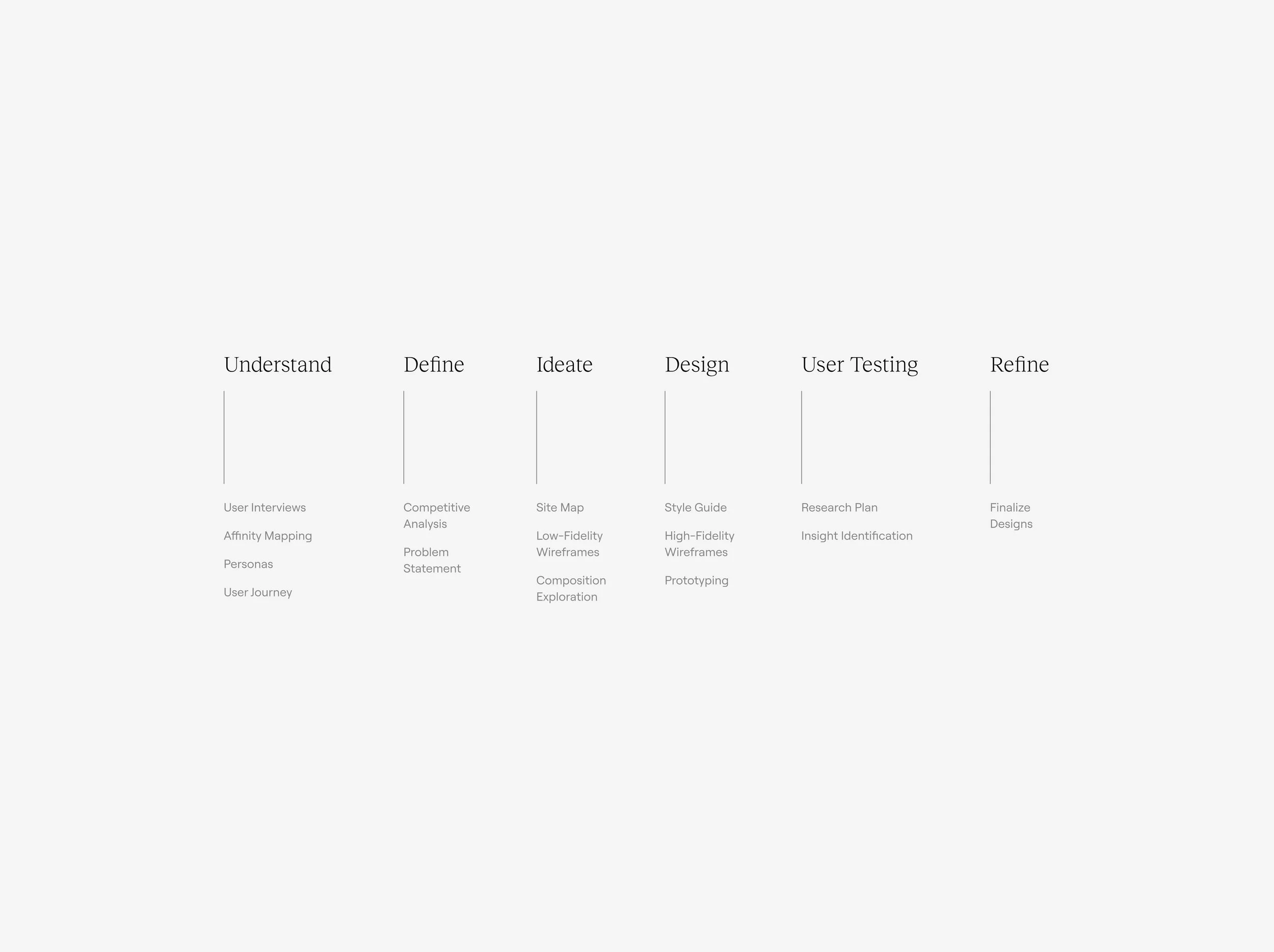
Background
Understanding the current state of Open Books’ platform and their pain points and needs.
Before I could begin sketching designs, it was important to make sure I understood where Open Books’ current website stood and what their needs were in a platform. Given that they’re a nonprofit that relies solely on donations and proceeds from their bookshop, I knew those two flows would need to be easy to navigate and intuitive to use. The organization also really needs to be able to communicate who they are and what they stand for when their audience visits their website. Currently, each of their website’s main functionalities seem like separate entities. I wanted to make sure that the redesigns conveyed a sense of brand continuity across each page.

User Interviews
Hearing from Open Books’ customers
Five phone interviews were conducted with users who have either donated or purchased books from Open Books. With a set of guided questions, I spoke to each participant for about 10 minutes and asked each user about their experience with the organization’s website. This helped paint a picture for current user pain points and how the redesign could improve upon the existing design.

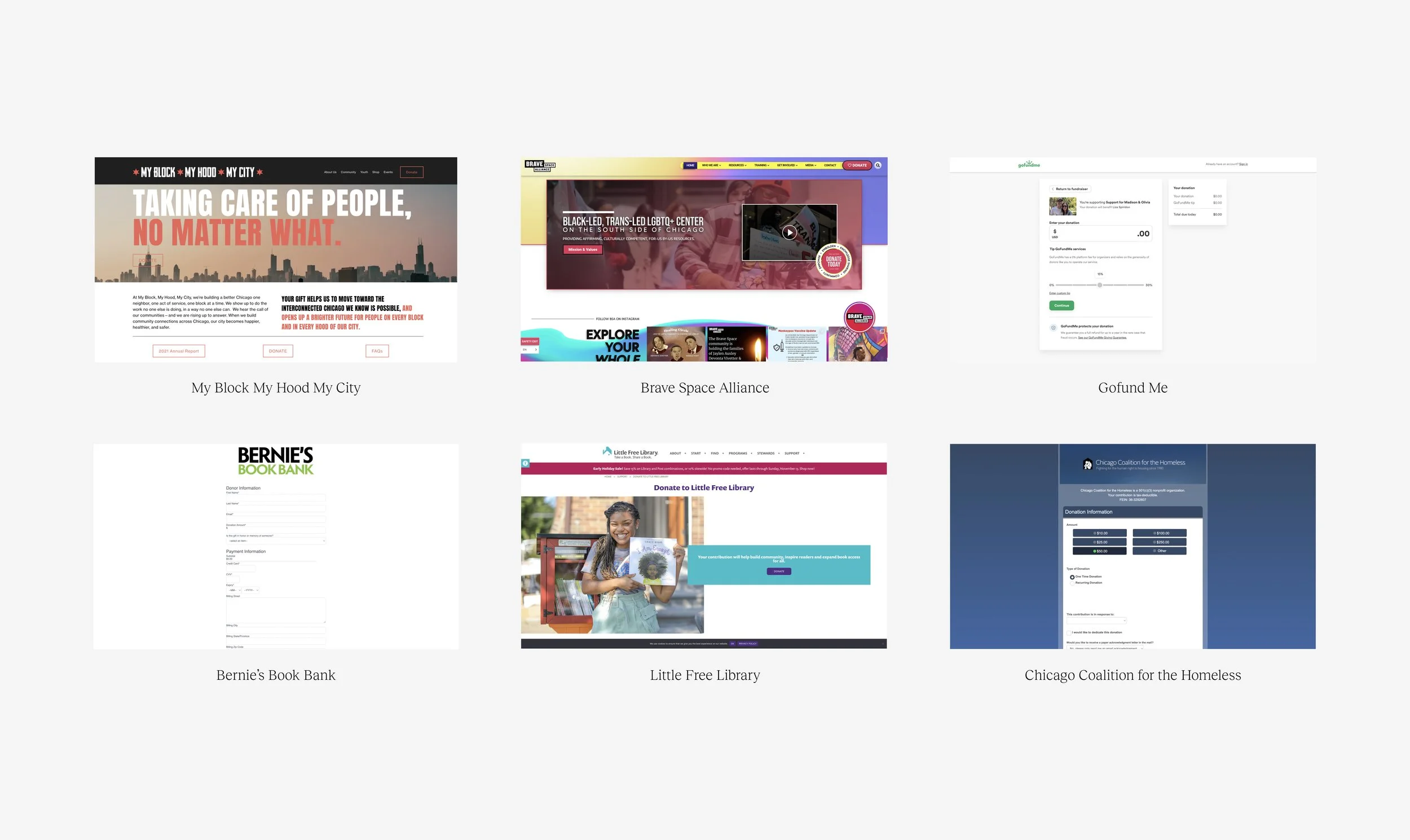
Competitive Analysis
Researching similar non-profit websites to compare and contrast donation and e-commerce flows
Six nonprofits composed of direct and indirect competitors were studied to gain a better understanding of strengths and weaknesses in their platforms. One main takeaway is that many organizations in the nonprofit space have websites that lack a clear user flow when it comes to their donation portal. By creating a website with an easy donation flow we can encourage users to donate and support the important work that these organizations are dedicated to. Full documentation of the analysis can be viewed here.
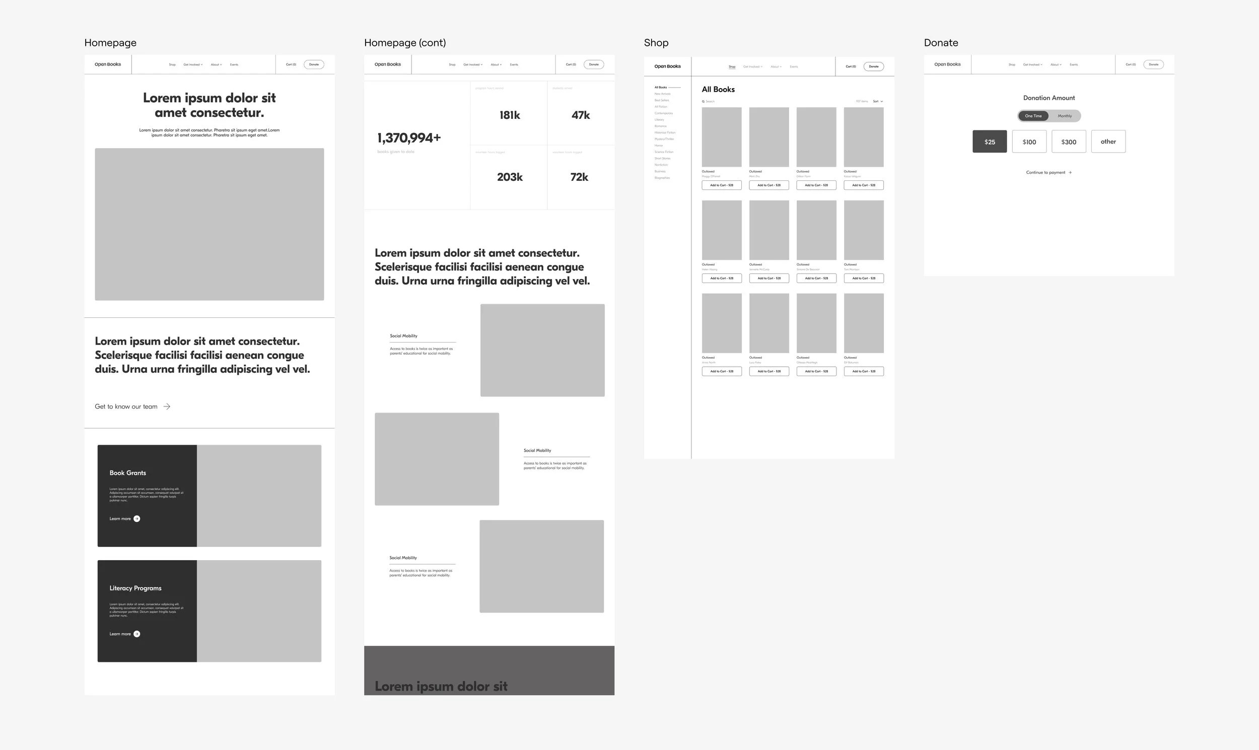
Wireframes
Ideating and early stages of design
Low fidelity wireframes were created for each major user flow. Since a major point of concern was brand consistency and an organized information structure it was important to test each part of the site to make sure those concerns were being addressed before moving into higher fidelity renderings.
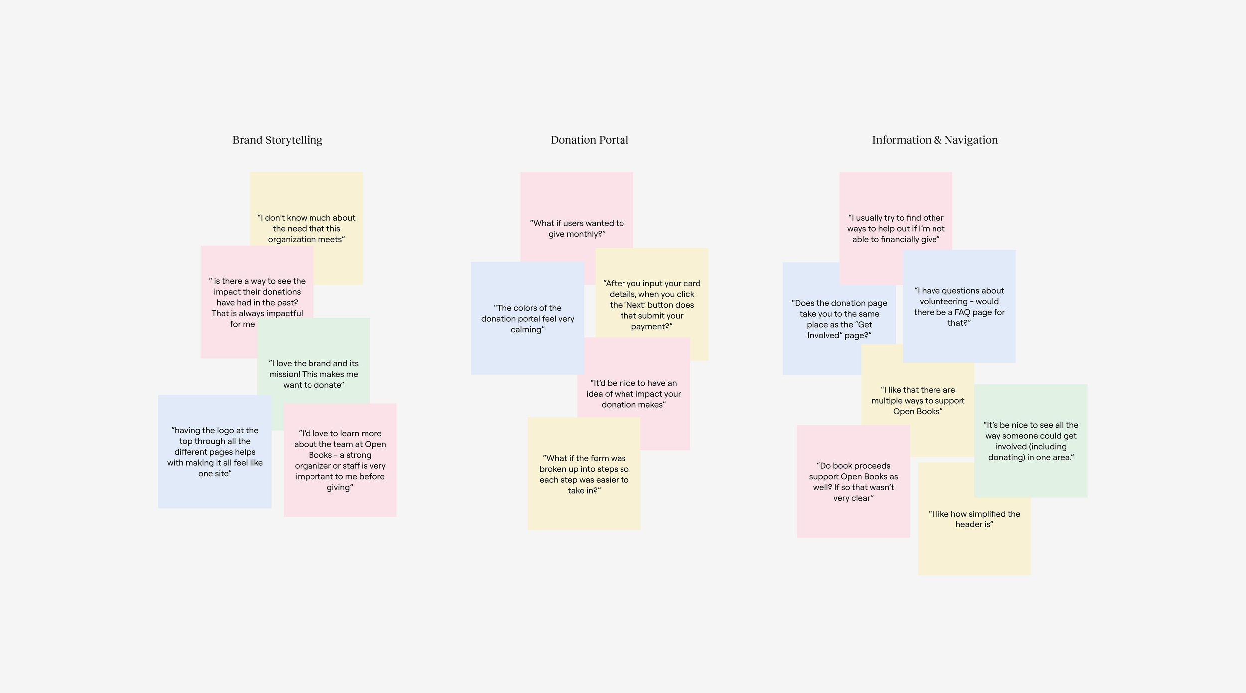
Usability Testing
Iterating and improving designs
The following insights were gained from the testing results and used to make improvements on the wireframes:
Users want a simplified donation screen without too many options or steps to complete before checkout.
Users are more likely to donate when they feel moved by the mission - stronger storytelling throughout the website is required to help users understand why the work of Open Books is needed.
Apart from donating, it was unclear to some users how to volunteer or contribute to the cause in other ways.
One round of unmoderated usability studies were conducted to improve the usability of the low fidelity wireframes. Participants were asked to complete a series of tasks using the prototype and a follow up interview was conducted after they finished their tasks. The study focused on answering the following questions:
How easy is it for users to learn about Open Books, donate, and shop through the website?
Are there any particular pain points that the users run into while using the app?
Visual Design
Brand identity and visual language
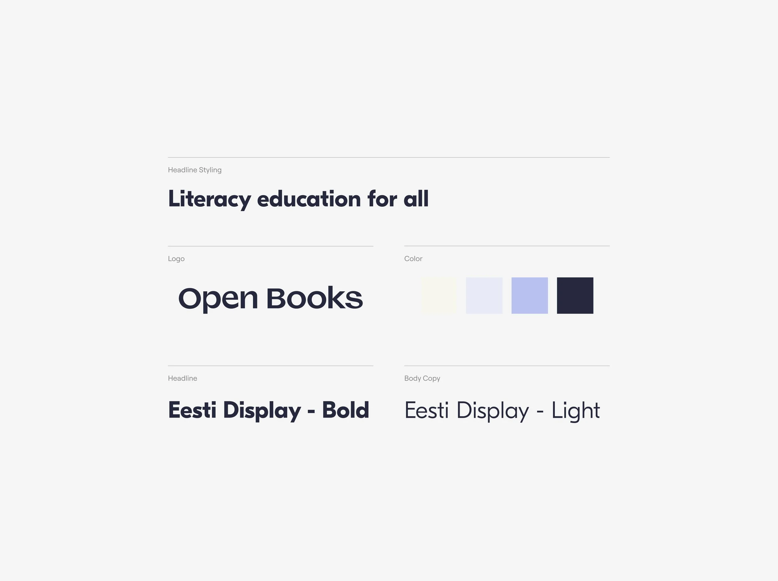
Careful consideration was given to the visual redesign of the website. As this was a major point of concern for many users, it was important to take the playfulness and friendliness that Open Books exudes and refine that into a visual language that was more elevated.
I spent a long time trying out various type combinations and ultimately went with a geometric sans that was clean and legible but still had a bit of playfulness to its shape. Sticking with a bold heading and a lighter body text helped contrast these two styles and established hierarchy throughout the website.
Typography
Color was also a very important part of developing the visual identity of Open Books. Their old website employed multiple bold colors across their platform and it ultimately made the experience feel scattered. I decided on moving forward with a classical navy blue as the primary color and a lighter lavender for the secondary color. With navy being a common color in education and the lavender adding a gentle playfulness to the mix I thought this combination provided the sophisticated friendliness that is key to the Open Books brand.
Color
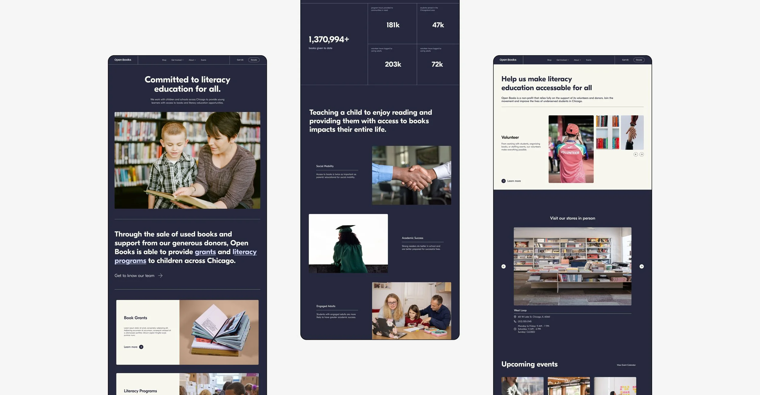
Homepage
Finalized designs for web
The redesigned homepage displays a much cleaner UI while informing visitors about the mission of Open Books, their impact, and all the ways an interested user can get involved.
Bold headlines are followed by short descriptions to communicate important parts of the brand’s identity without overwhelming the user. I also made sure to include visual aids and quantify-able impact measures to help the user understand that their support of Open Books makes a difference.
Donation Page
Why your support matters
Since donations are such an important part of Open Books’ organization, I wanted this page to be compelling and easy to scan. It was important to use this page to communicate the mission of Open Books and how the user’s monetary support impacted students. I chose to highlight quantify-able support measures and how those amounts were spent.
I wanted the website to feel very circular in terms of its information architecture and included several CTAs that would bring the user to other parts of the website if they wanted to learn more about the organization before donating.

Donation Portal
Clean, clear, and simple
Broken up into a series of steps, the donation portal displays a clean UI with clear and simple payment options for a quick and easy checkout. A payment summary hovers at the top for the user’s reference.
As identified during the usability tests, it was important for the buttons to be descriptive in letting the user know where they were in the donation process. Specific copy was given to each button to indicate to the user what was coming next.

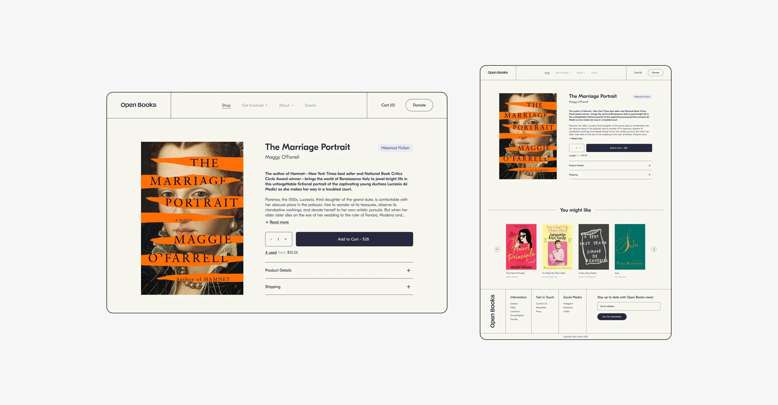
Online Bookshop
Playful, elevated, and an alternative way to support Open Books
One common complaint from users about the current website is that the shop was very unpleasant to navigate and that the visual design was lacking. The redesign displays a shop page that feels familiar to the user and makes it easy to sort through books available for purchase by genre or keyword.

Product Page
A familiar UI with clear calls to action
The product details page displays a UI similar to that of many familiar online book shops but maintains the visual branding and style of the organization. Users can choose to purchase a book new or select from used copies for a discounted rate. This page also offers other book recommendations based on the user’s history and encourages the user to continue browsing the shop.
About Open Books
Who are we and what do we stand for?
Getting to know the team behind Open Books was an important step for most users who were interested in donating or volunteering. I wanted this page to feel friendly and authentic while still conveying practical information about the operations of the organization.

Mobile Adaptation
Responsive design across multiple devices
An important element to this redesign was making sure that their new website was responsive. Recent studies show that over 62% of all website traffic comes from users on a mobile device. An effective website needs to be able to adapt across screens and devices.
The challenge for the mobile design was displaying all the same information on a much smaller screen size. With users not being able to hover on mobile this also meant altering certain interactions (like the navigation items). These subtle but important adaptations create a fully responsive experience that is unified and centered on the user’s experience.

Reflection
This project challenged me as a designer for multiple reasons. Not only did I have to consider the multifaceted needs the website would be required to fulfill (operating as a donation platform AND an online shop) but I also created a new visual language for Open Books (creating a new logo, style guide, and refreshing it’s branding while still maintaining Open Book’s playful and friendly personality).
Continuous Improvement and Next Steps
I’d love to explore how this website could continue to grow in serving Open Books and its users. Here are a few areas that I think could be further improved upon and actions that I would take to create an even more effective product.
Comparing profit margins before and after the redesign to understand its impact.
Conducting another round of user testing to identify pain points and user needs.
Takeaways