The Art Institute of Chicago
Mobile App

A museum pocket guide to centralize information for users regarding, exhibitions, upcoming events, and tours.
Problem
With over 300,000 works of art housed at the Art Institute of Chicago, learning about art history can be daunting. The current Art Institute App is not user friendly, lacks functionality, and displays a user interface that is overwhelming and scattered.
Solution
Redesign a more beautiful, functional, and intuitive version of The Art Institute’s mobile app so that users can quickly and easily learn on the go.
Team
Individual project mentored by Anna Brenner
Details
8 weeks (2022)
Mobile Application
Contribution
End-to-end UX and UI design
Platform
Mobile App

User research
Identifying pain points and understanding what users need
Five interviews were conducted with individuals who’ve visited an art museum within the past year. I wanted to understand how current museum apps met or fell short of their needs and how technology could be used to enrich a visitor’s experience. A primary pain point identified throughout the interviews is that users often feel lost or overwhelmed during their museum experience and want a quick and easy way to look up information or receive guidance.

Competitive Analysis
Understanding existing product offerings in the market
Three other apps within the museum/art history space were compared against the offerings of the current Art Institute app. Strengths and weaknesses were identified for each product as well as potential gaps in the market. Full documentation of the analysis can be viewed here.

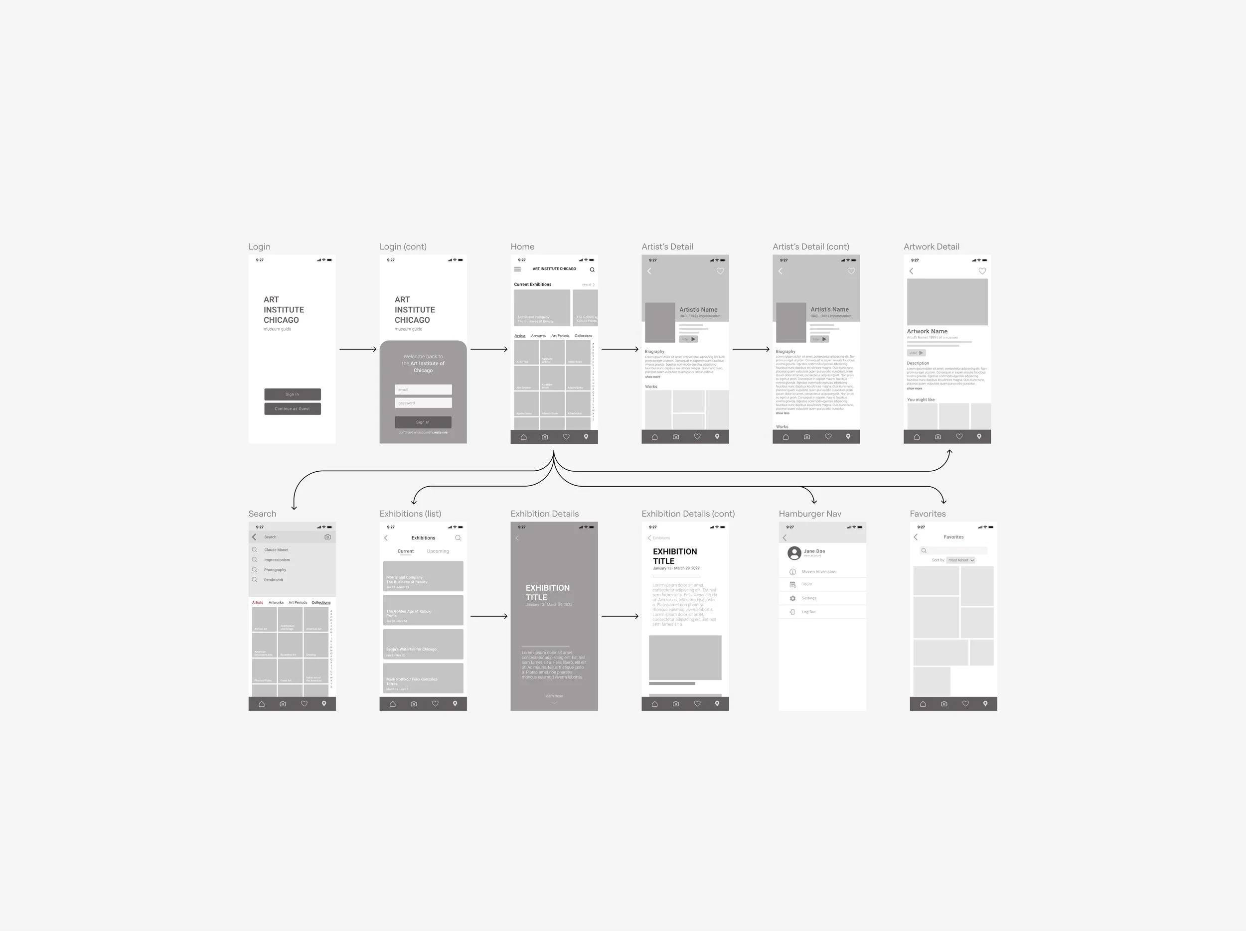
Wireframes
Ideating and early stages of design
Low fidelity wireframes were created to better understand the structure of the app. With there being so much information stored on the app, I wanted to prioritize a clean visual design with an intuitive user flow.
Usability Testing
Iterating and improving designs
Two rounds of unmoderated usability studies were conducted to improve the usability of the low fidelity wireframes. Participants were given 10 minutes to complete a list of tasks using the prototype. These studies focused on answering the following two questions:
How easy is it for users to find the information they need?
Are there any particular pain points that the users run into while using the app?
An affinity map was created using the test responses and the following insights were used to improve the low fidelity prototype before moving forward with high fidelity designs.
Users need better visual cues for how to navigate through the onboarding screens.
Clearer iconography is required throughout the app to avoid confusion.
Users need an expansive and efficient search as it’s a popular method for navigating through the map.

Visual Design
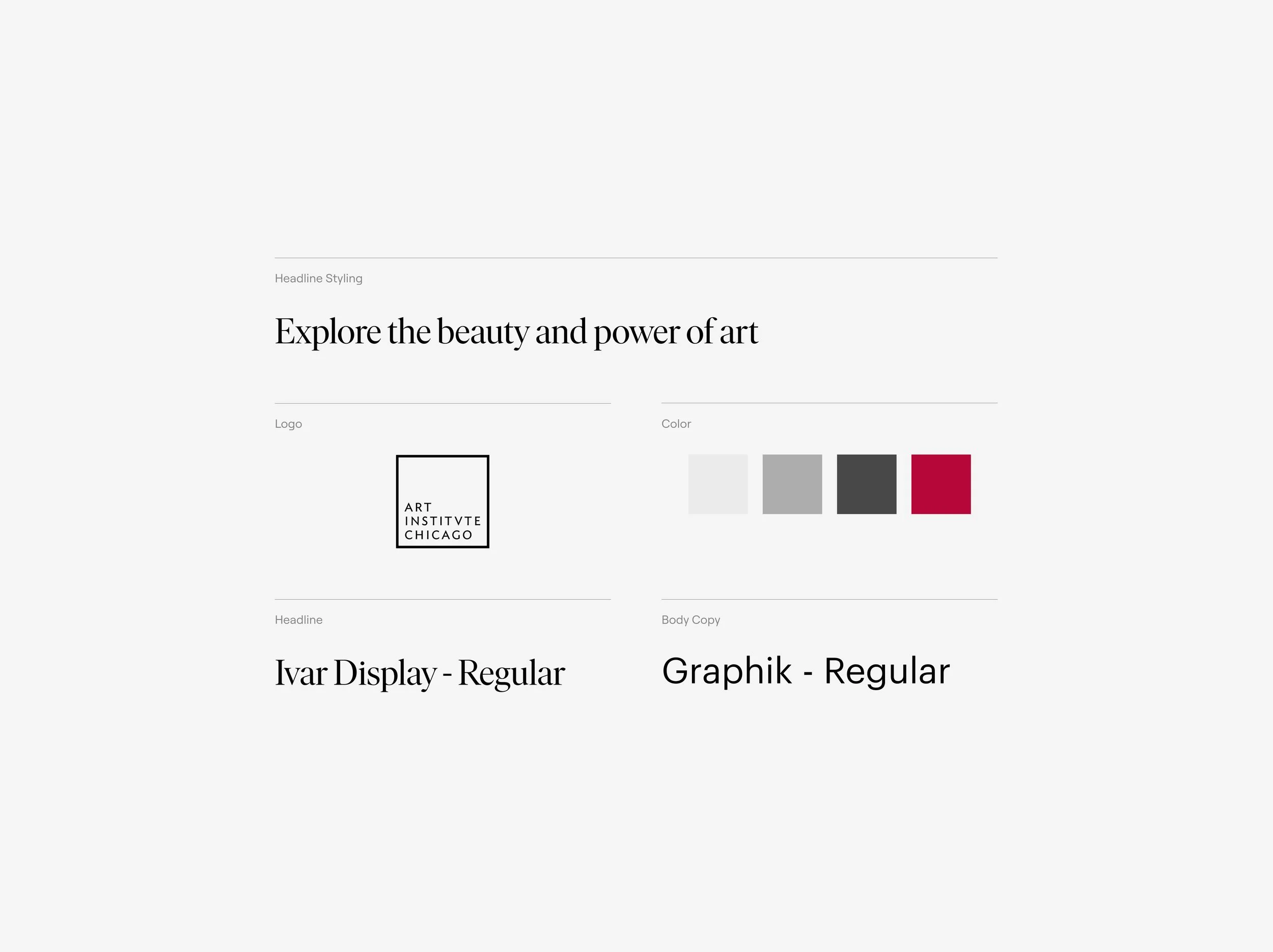
Brand identity and visual language
I wanted the visual design to feel refined, fresh, and approachable. Since the Art Institute of Chicago is already such an established institution I wanted the app to feel like an extension of the museum’s existing brand. They currently employ various shades of gray with ample amounts of white space and the occasional pop of berry red. I brought the same colors into the app for brand continuity.
Typography was also carefully considered. With the app being quite information dense I chose an elegant geometric sans for legibility. This was paired with a classical serif inspired by the popular styles of the early 1900s. Together this pairing conveys a sense of sophistication and calls upon the nostalgia of historic Americana.
High Fidelity Designs
Final mock walkthrough
The proceeding sections display the finalized high fidelity designs of the redesigned app, highlighting the simple and intuitive user flow and added features that make this product a worthy museum companion.
For the splash and onboarding screens I took inspiration from the likes of streaming apps to feature a multitude of artworks and give the user a preview for what’s to come.

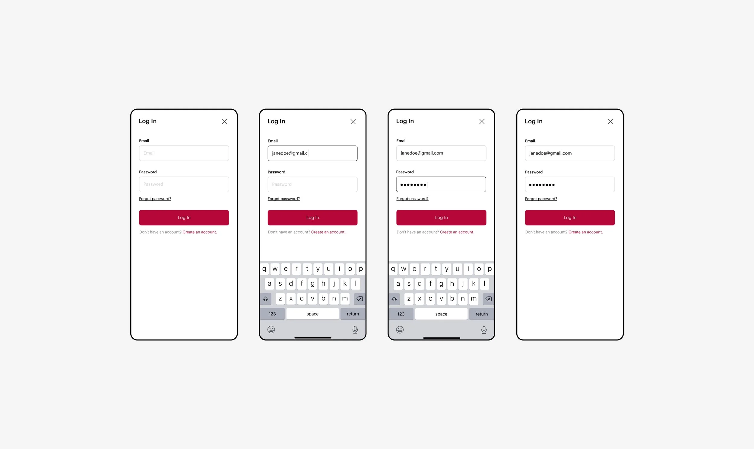
Onboarding & Log In
A simple and clean approach
The primary brand color is introduced during the initial log in flow. This sets the precedent for the rest of the app and is easily recognizable as museum’s primary branding color for those familiar with the Art Institute. The onboarding and log in screens are minimal and clean with plenty of white space. I wanted to make sure this first introduction to the app didn’t overwhelm users and that the login was simple and straightforward.
Homepage
An expansive feed to explore
I designed the homepage to be an evolving space for users to skim through current exhibitions, museum highlights, and explore featured artworks and/or artists. This page is meant to invoke curiosity and inspiration and preview a bit of what the museum has to offer. Users can scroll until they see something that interests them or they can use this page as a highlight reel for the current happenings at the Art Institute.

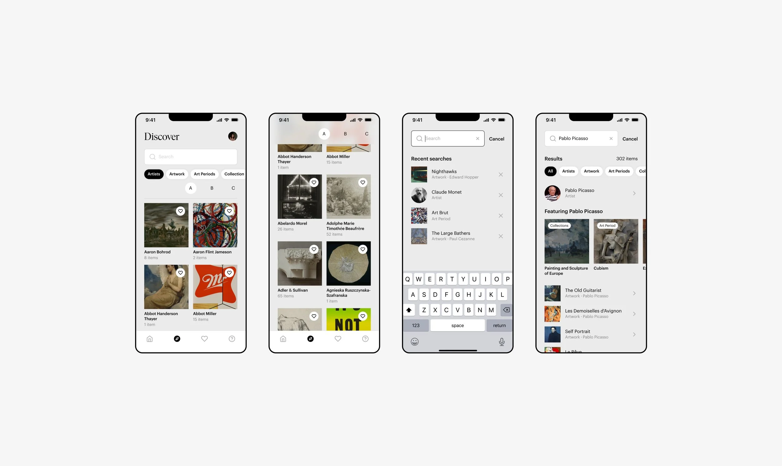
Discover & Search
An index of artists, artwork, and collections housed at the museum
With there being such an enormous amount of information stored on the app, I wanted to make sure there was a clean and organized way for users to find the artwork or artist they were looking for. With a main takeaway from usability testing being that users mainly use the search to find what they need, I knew the search needed to be expansive and that its results were easy to skim at a glance. I created differences in the visual affordance of the search results based on the categories they fell into in order to create a search that was scannable and quick to read.
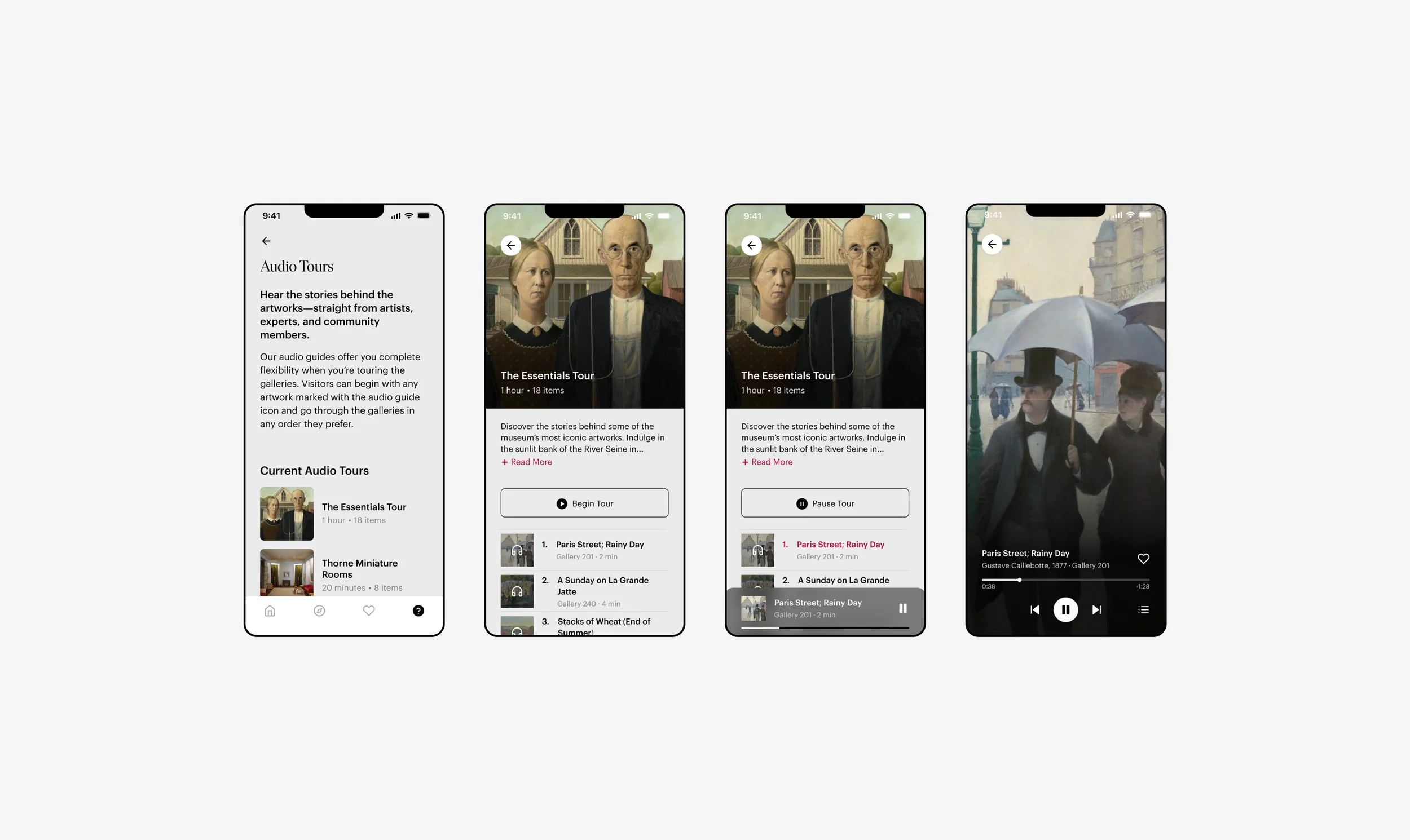
Audio Tours
An alternative way to explore
Audio tours were a preexisting feature on the old version of the app but the flow to select and listen to a tour was slow and confusing. I simplified and redesigned this feature to improve ease and functionality. The user can choose from a list of available tours, preview the artwork included in that tour, and listen or pause with simple UI that already feels familiar as inspiration was taken from popular audio platforms such as Spotify.
Exhibitions
Current and upcoming collections
With exhibitions being such a large draw to visitors I wanted to create a way for users to preview current and upcoming collections on display and create a sense of excitement for what the museum has to offer. Users are able to scroll through a simple gallery to preview artworks, read about the exhibition of interest, and even view the artwork in an interactive full screen mode.

Artwork & Artist Details
Art history education that is accessible to all
Art history can be a daunting subject for many individuals who want to learn but don’t know where to start. It’s a subject with an expansive history — spanning time, space, and culture. For this reason I wanted to create a way to learn about art that was approachable and gentle. The artwork and artist details pages present information with ample amounts of white space and visual aids to make the experience enjoyable and anxiety free. Users can choose to read a short synopsis or expand the details view for more in-depth contextual knowledge.

Museum Information & Settings
Tying it all together
In the final tab of our main navigation the user will find practical museum information and setting options. With a simple list view, users can personalize their experience, read about the museum’s accessibility pledge, learn about the history of The Art Institute, and much more.

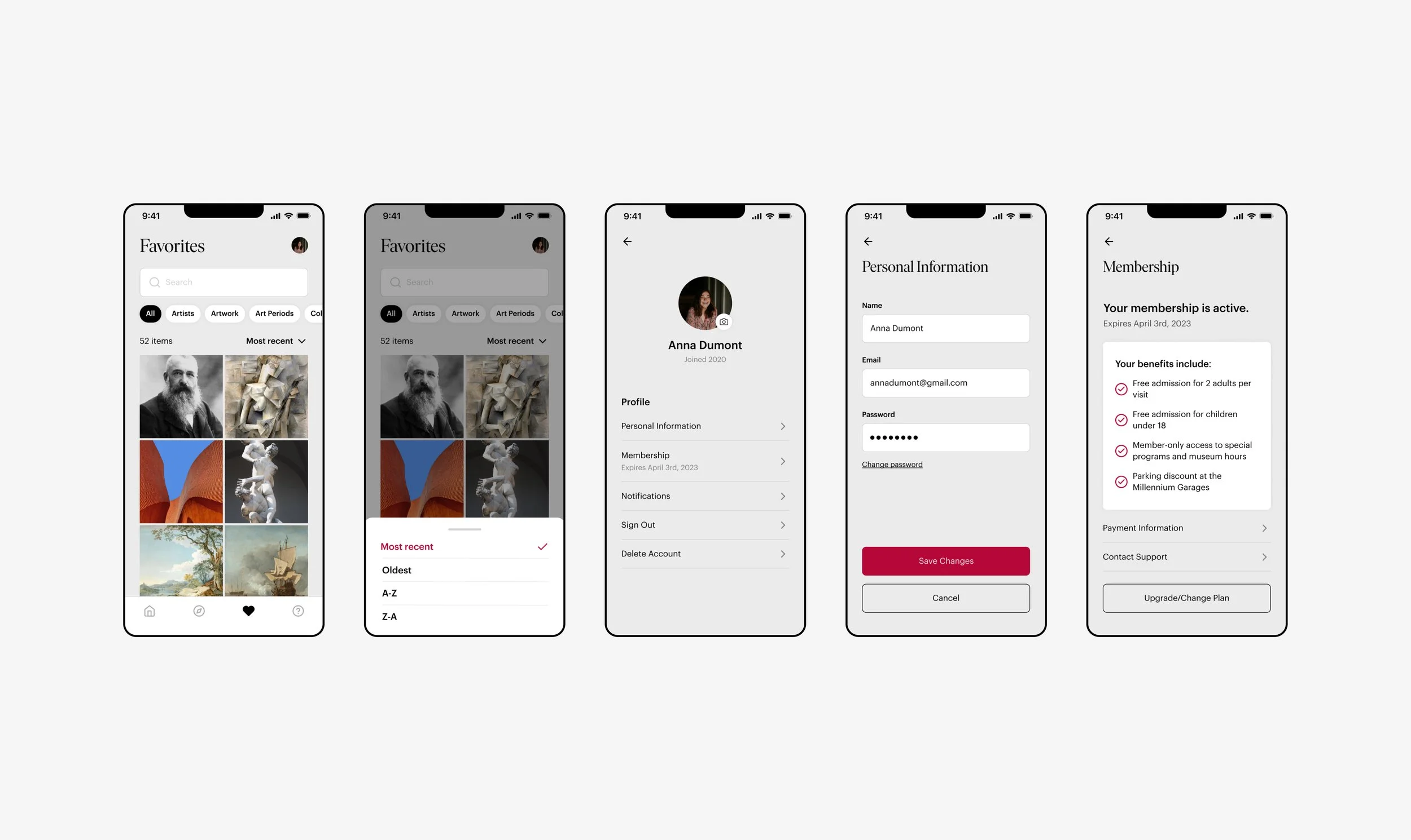
Favorites & User Profile
A personalized experience
One key takeaway from the usability studies was that users wanted a digital experience that made the app worth downloading. On top of the added functionality of the redesigned app I wanted to add a sense of personalization to each user’s experience. I created a way for users to ‘Favorite’ pages, view their membership details, and receive recommendations based on their past likes. This not only customizes each person’s experience but curates content specifically garnered to their interests.
Reflection & Key Learnings
Continuous Improvement and Next Steps
I’d love to explore how this app can continue to improve and serve its user base. Here are a few areas that I think could further propel this product and make it event more enjoyable to use:
Incorporation more animation and motion design throughout the app for a truly interactive experience.
Exploring a reliable way-finding option to help users navigate within the museum.
Conducting another round of user testing to identify pain points and user needs.
Takeaways
This project posed the question — how do we organize massive amounts of information in a way that’s intuitive and enjoyable? It challenged me to marry strong information architecture with a beautiful and efficient visual language in order to create a product that was both beautiful and effective.